Guide
AI image printing guide
Learn how to print AI-generated images without blurry output, missing bleed, color surprises, or rejected files.
AI images can look finished on screen and still fail at the print counter. The screen preview hides the physical questions a printer has to answer: how large will this be, how many pixels are available at that size, what happens at the trim edge, and what format can move through production without guesswork?
This guide explains the practical path from generated artwork to a shop-friendly file. It is written for creators, marketers, designers, and small teams who already have an image and want to print it cleanly as a poster, sticker, flyer, canvas, sign, transfer, or print-on-demand product.
The safest approach is not to apply every possible fix. The safest approach is to check the file, understand the risk, and make only the prep decisions that match the product being ordered.
Why AI images fail in print
Most AI image failures are not creative failures. They are production mismatches. A generator may create a beautiful 1024 pixel square, but that same image becomes soft when stretched to an 18 x 24 inch poster. A picture may have a perfect edge on screen, but print trimming needs artwork beyond the cut line so a tiny cutting shift does not leave a white sliver.
Text is another common failure. AI-generated lettering can look convincing in a preview and fall apart when printed large or inspected up close. Preflight should flag suspicious tiny text, low resolution, transparency, missing bleed, unsupported file structure, and edge risks before the user spends money on output.
The print-ready checklist
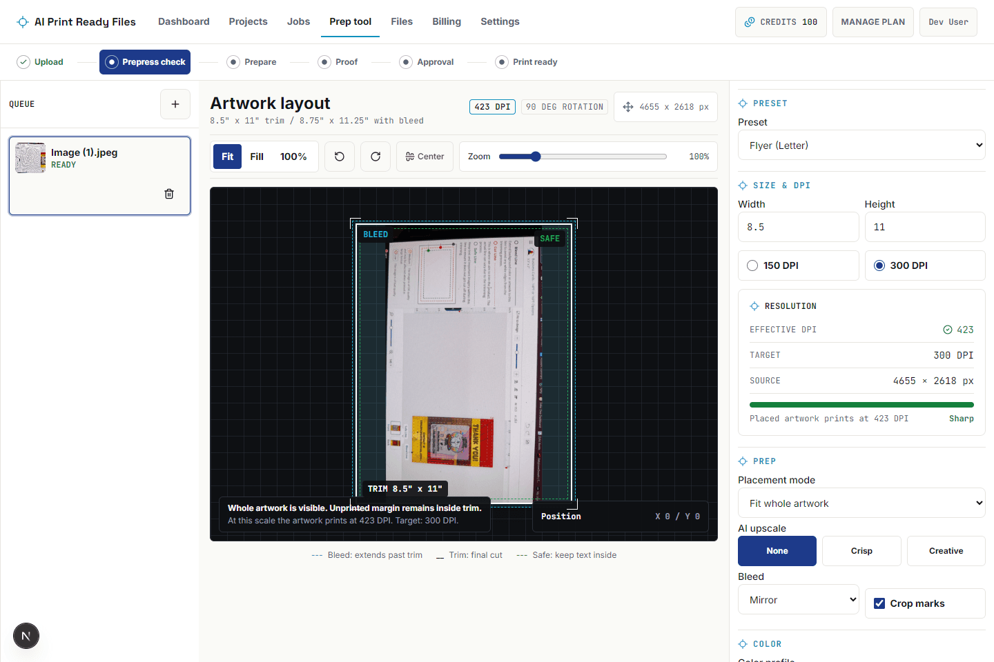
A useful print-ready check starts with the final size, not the source file name. The file needs enough effective DPI at the actual print dimensions. It needs bleed when artwork touches the edge. It needs a safe zone for important text and faces. It needs a file format the printer or platform accepts. It needs color handling that is honest about the shift from screen light to ink or toner.
The checklist should also produce a plain-language report. A user should be able to send the report to a shop and show what was checked, what changed, and what risks remain. That report turns print prep from a mystery into a repeatable handoff.
Choose size before choosing fixes
The same generated image can pass for a small sticker and fail for a large poster. That is why the target product and final dimensions come before upscale, crop, or export format. Pixel dimensions only become meaningful after inches are known.
If the effective DPI is close to the target, a crisp upscale can be useful. If the effective DPI is far below the target, the better answer may be a smaller print size or new source artwork. Honest prep is allowed to say no when the file is too weak to rescue.
Bleed and edge decisions
Bleed is extra artwork beyond the trim. AI images often end exactly at the visual edge, which is risky for business cards, flyers, posters, stickers, canvas wraps, and signage. Mirror bleed can work for simple edges. Generative bleed can work when mirroring would look obvious, but it should be reviewed because it invents edge content.
Crop and position matter too. Cover mode can make the artwork fill the product, but it may cut off faces, logos, or text. Contain mode protects the full image but can create borders. A print-prep tool should show the trim box and let the user move or scale the artwork before export.
Color expectations
Screens use RGB light. Many print workflows use CMYK inks or a managed print profile. Bright blues, greens, and neon-like colors can shift when converted. A good prep workflow should not promise identical color on every printer. It should explain that the goal is predictable production, not magical color matching.
For most users, the right behavior is simple: keep the original safe, create a print-prepared export, include the final color handling in the report, and let the printer's proof remain the final authority for material and ink behavior.
What to send to the printer
The final handoff should include the prepared file and the verification report. The file should match the requested dimensions, contain the selected bleed and crop marks when needed, and use the format the printer expects. The report should include source size, final size, effective DPI, bleed, color handling, and any warnings.
Do not send a folder full of alternate guesses unless the shop asks for them. A specific prepared file with a clear report is easier for a production team to approve than five exports with no explanation.
How to read the report
A preflight report should be read like a production checklist, not like a school grade. A pass means the file meets the checked rule. A warning means the file may print acceptably depending on product, viewing distance, material, or printer preference. A fail means the file is likely to be rejected or produce a visibly bad result unless it is fixed or the print size changes.
The best reports connect each issue to a decision. Low DPI should suggest upscale, smaller output, or new source art. Missing bleed should suggest edge extension, crop, or a border. Suspicious AI text should warn the user to inspect lettering manually because no export setting can make fake words meaningful.
Common product examples
A poster usually cares most about DPI, crop, and color expectations. A business card cares about bleed, safe zone, small text, and PDF structure. A sticker cares about edge quality, transparency, and whether the shape needs a cut path. A canvas wrap cares about extra edge content because artwork may wrap around the side of the frame.
Those examples are why generic 'make it 300 DPI' advice is not enough. Print prep works best when the file is checked against a specific product, final size, and delivery path.
How to prepare the file
- 1Upload the generated image and run the preflight scan before editing anything.
- 2Choose the product and final print size so DPI can be calculated honestly.
- 3Read pass, warning, and fail items in the report and decide which risks matter for the product.
- 4Add upscale only when the file is close enough to benefit from it.
- 5Add bleed and crop marks when the artwork or printer requires edge-to-edge output.
- 6Review crop, position, color handling, and final format before downloading the prepared file.
- 7Keep the verification report with the export so the printer can see what changed.
Questions
Can every AI image be printed well?
No. Some images are too small, too compressed, or too full of fake text to print well at the desired size. A good preflight report should say that clearly.
Is 300 DPI always required?
No. Close-viewed pieces often target 300 DPI, while large signs or banners can use lower effective DPI because they are viewed from farther away. The final product matters.
Should I always convert to CMYK?
Not always. Some platforms prefer RGB uploads and convert internally. The right answer depends on the printer or platform, which is why the report should state the export assumptions.
What is the safest first fix?
Set the final size and check effective DPI. That one step prevents many bad decisions because it tells you whether the file has enough information for the product.
Does a print-ready file replace a proof?
No. Print prep reduces technical rejection risk. A printer proof still controls final material, finishing, and approval.